Color Palette
Jumio brand colors were selected because of their accessibility as
well as their relation to the
boldness of modern technology. Our color palette also celebrates the vivid contrasts of
our global market.
Primary brand colors
Jumio White
R255 G255 B255
C0 M0 Y0 K0
#FFFFFF
PMS White
Jumio Green
R90 G204 B41
C63 M0 Y100 K0
#5acc29
PMS 802C
Jumio Gray
R50 G50 B50
C0 M0 Y0 K90
#323132
PMS Neutral Black C
Brand gradient
R90 G204 B41
C63 M0 Y100 K0
#5acc29
R19 G223 B206
C63 M0 Y30 K0
#13dfce
Iconography
Jumio iconography should always support the Jumio brand aspect of simple
and informative.
Icons should be solid filled, use limited shapes and detail, and easily depict a word or
phrase at a quick glance.
Icon color and size
Jumio icons are used to support content as a secondary element, so
icons should be small to medium in size. Icons placement should maintain a distance
from the content that is roughly equal to the size of the icon.
Primary icons
Jumio’s product, use case, and industry icons are either solid #323132
on light or #FFFFFF on dark. They are not to be used in any other color. Existing
Jumio product icons should always be used. See below for a sample of Jumio product
icons.
Jumio Identity Verification
Jumio Document Verification
Supporting icons
Jumio supporting icon style should be used when depicting product
features, benefits, or other supporting content. Here are some examples of Jumio
supporting icons:
Imagery
Jumio photography should always portray subjects of a variety of age,
race, and gender to support Jumio’s globally inclusive brand. Photos should be global
locations when possible, and use a mix of indoor and outdoor settings. Use images from
Jumio stock library whenever possible.
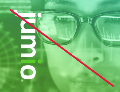
Photo treatments
Photos can either be all black and white, duotone with the brand
gradient, or use the brand “slice” photo style. To accomplish this photo style,
first make the photo black and white, and adjust contrast as needed. Select a
portion of the photo to be colorized, either a straight horizontal or vertical
“slice.” This slice layer should then be overlaid with the brand primary gradient,
and set to a responsible opacity based on the photo’s contrast. The Jumio logo
should not be used on top of the gradient unless the background is dark enough to
see the green “i” clearly. Bottom or right portion of the photo should be converted
to grayscale. Contrast of the final split photo should be set so the image is clear
and so white text can be set on top and remain legible. Here are some examples:
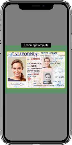
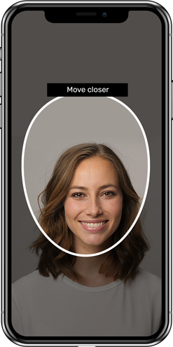
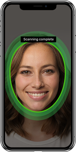
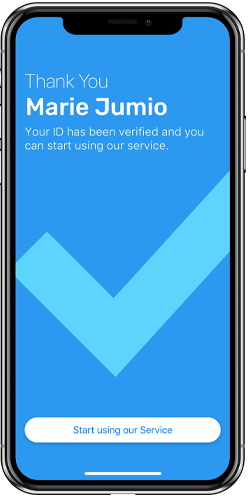
Screenshots
Always use Jumio built and approved screenshots. When using
screenshots in design, they should be overlaid on the most recent/updated devices.
Here are some examples:


